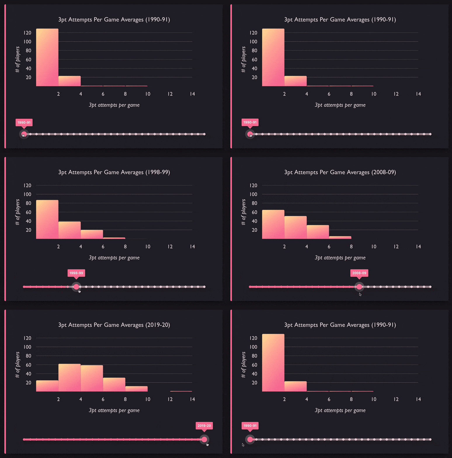
We've recently released VictoryHistogram, a new charting component we've added to our Victory library that allows you to create histogram charts in React. Histograms, while looking similar to bar charts, are different. Rather than displaying categorical data, histograms are used to visualize the distribution of data, by "binning" or "bucketing" data points into ranges.
Previously there wasn't an automatic way to do this in Victory; you'd have to do much of the data processing yourself and plot the results with VictoryBar. Now with VictoryHistogram, you can easily create histograms.
In Action
Let's take a look and see how you might go about using VictoryHistogram for visualizing your data.
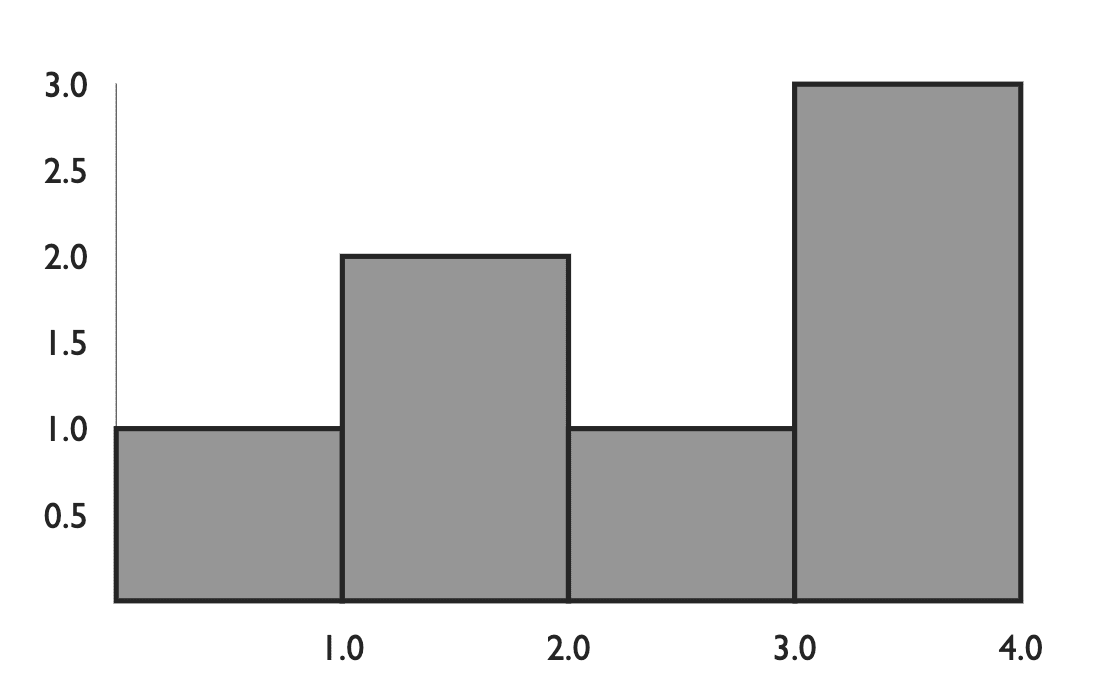
Here's a basic example. We have our array of data, and we pass that into VictoryHistogram which automatically bins these values into four bins. You can customize this behavior via the bins prop, with which you can specify specific bin ranges or an approximate number of bins.
constApp=()=>{const data =[{x:0},{x:1},{x:1},{x:2},{x:3},{x:4},{x:4}];return(<VictoryChart><VictoryHistogramdata={data}/></VictoryChart>);};
jsx
Let's add some styling to these bins using the style and cornerRadius props.
constApp=()=>{const data =[{x:0},{x:1},{x:1},{x:2},{x:3},{x:4},{x:4}];return(<VictoryChart><VictoryHistogramstyle={{data:{fill:"hsl(355, 88%, 67%)",stroke:"hsl(355, 10%, 25%)"}}}cornerRadius={5}data={data}/></VictoryChart>);};
jsx
Let's try using some more interesting data. In this case the data represents songs listened to on a particular date for a particular person. So each object represents one song, and contains the date it was listened to and the genre of the song.
So we pass this data to VictoryHistogram and we specify that the x value is located at the day property of each object by passing the prop, x="day"
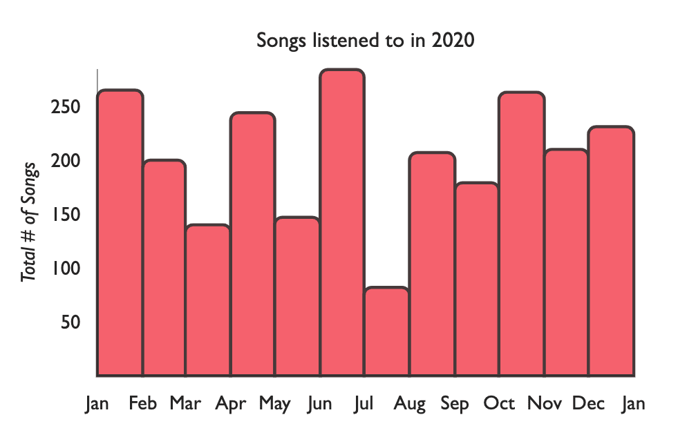
Let's add a title using VictoryLabel. Let's also update our axes by rendering two <VictoryAxis /> components, and using tickFormat and tickCount to display all of the month tick labels on the x-axis, and add a label to the y-axis via the label prop.
importdatafrom"./data.js";// [{ day: new Date(2020, 3, 1), genre: 'hip-hop' }, ...]const sharedAxisStyles ={tickLabels:{fontSize:13},axisLabel:{padding:39,fontSize:13,fontStyle:"italic"}};constApp=()=>{return(<VictoryChartscale={{x:"time"}}style={{parent:{padding:36}}}><VictoryLabelx={225}y={30}textAnchor="middle"text="Songs listened to in 2020"/><VictoryHistogramstyle={{data:{fill:"hsl(355, 88%, 67%)",stroke:"hsl(355, 10%, 25%)"}}}cornerRadius={5}data={data}x="day"/><VictoryAxistickCount={12}tickFormat={date=> date.toLocaleString("default",{month:"short"})}style={sharedAxisStyles}/><VictoryAxisdependentAxislabel="Total # of Songs"style={sharedAxisStyles}/></VictoryChart>);};
jsx
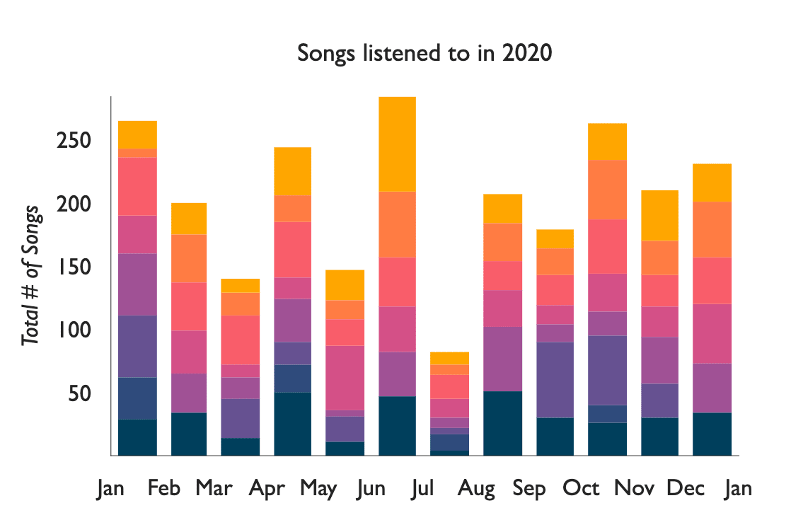
Right now each bar represents the total songs listened to in a month, but we don't really see the breakdown of the songs that are included in that month. Luckily we have the genre of each song. So we can split up our data by genre using lodash groupBy (or whatever method you prefer). Then render a VictoryStack component and inside of that, we render a VictoryHistogram for each genre we have.
importdatafrom"./data.js";// [{ day: new Date(2020, 3, 1), genre: 'hip-hop' }, ...]const groupedData = _.groupBy(data,({ genre })=> genre);/*
{
rock: [{ day: new Date(2020, 3, 1), genre: 'rock' }, ...],
hip-hop: [{ day: new Date(2020, 3, 1), genre: 'hip-hop' }, ...]
...
}
*/const sharedAxisStyles ={tickLabels:{fontSize:13},axisLabel:{padding:39,fontSize:13,fontStyle:"italic"}};constApp=()=>{return(<VictoryChartscale={{x:"time"}}style={{parent:{padding:36}}}><VictoryLabelx={225}y={25}textAnchor="middle"text="Songs listened to in 2020"/><VictoryStackcolorScale={["#003f5c","#2f4b7c","#665191","#a05195","#d45087","#f95d6a","#ff7c43","#ffa600"]}>{Object.entries(groupedData).map(([key, dataGroup])=>{return(<VictoryHistogramdata={dataGroup}x="day"style={{data:{strokeWidth:1,stroke:"hsl(324, 10%, 20%)"}}}/>);})}</VictoryStack><VictoryAxistickCount={12}tickFormat={date=> date.toLocaleString("default",{month:"short"})}style={sharedAxisStyles}/><VictoryAxisdependentAxislabel="Total # of Songs"style={sharedAxisStyles}/></VictoryChart>);};
jsx
We can tweak the styling again a little more, remove the borders via the style prop, and space the bins out a bit using the binSpacing prop.
importdatafrom"./data.js";// [{ day: new Date(2020, 3, 1), genre: 'hip-hop' }, ...]const groupedData = _.groupBy(data,({ genre })=> genre);/*
{
rock: [{ day: new Date(2020, 3, 1), genre: 'rock' }, ...],
hip-hop: [{ day: new Date(2020, 3, 1), genre: 'hip-hop' }, ...]
...
}
*/const sharedAxisStyles ={tickLabels:{fontSize:13},axisLabel:{padding:39,fontSize:13,fontStyle:"italic"}};constApp=()=>{return(<VictoryChartscale={{x:"time"}}style={{parent:{padding:36}}}><VictoryLabelx={225}y={25}textAnchor="middle"text="Songs listened to in 2020"/><VictoryStackcolorScale={["#003f5c","#2f4b7c","#665191","#a05195","#d45087","#f95d6a","#ff7c43","#ffa600"]}>{Object.entries(groupedData).map(([key, dataGroup])=>{return(<VictoryHistogramdata={dataGroup}x="day"binSpacing={8}style={{data:{strokeWidth:0}}}/>);})}</VictoryStack><VictoryAxistickCount={12}tickFormat={date=> date.toLocaleString("default",{month:"short"})}style={sharedAxisStyles}/><VictoryAxisdependentAxislabel="Total # of Songs"style={sharedAxisStyles}/></VictoryChart>);};
jsx
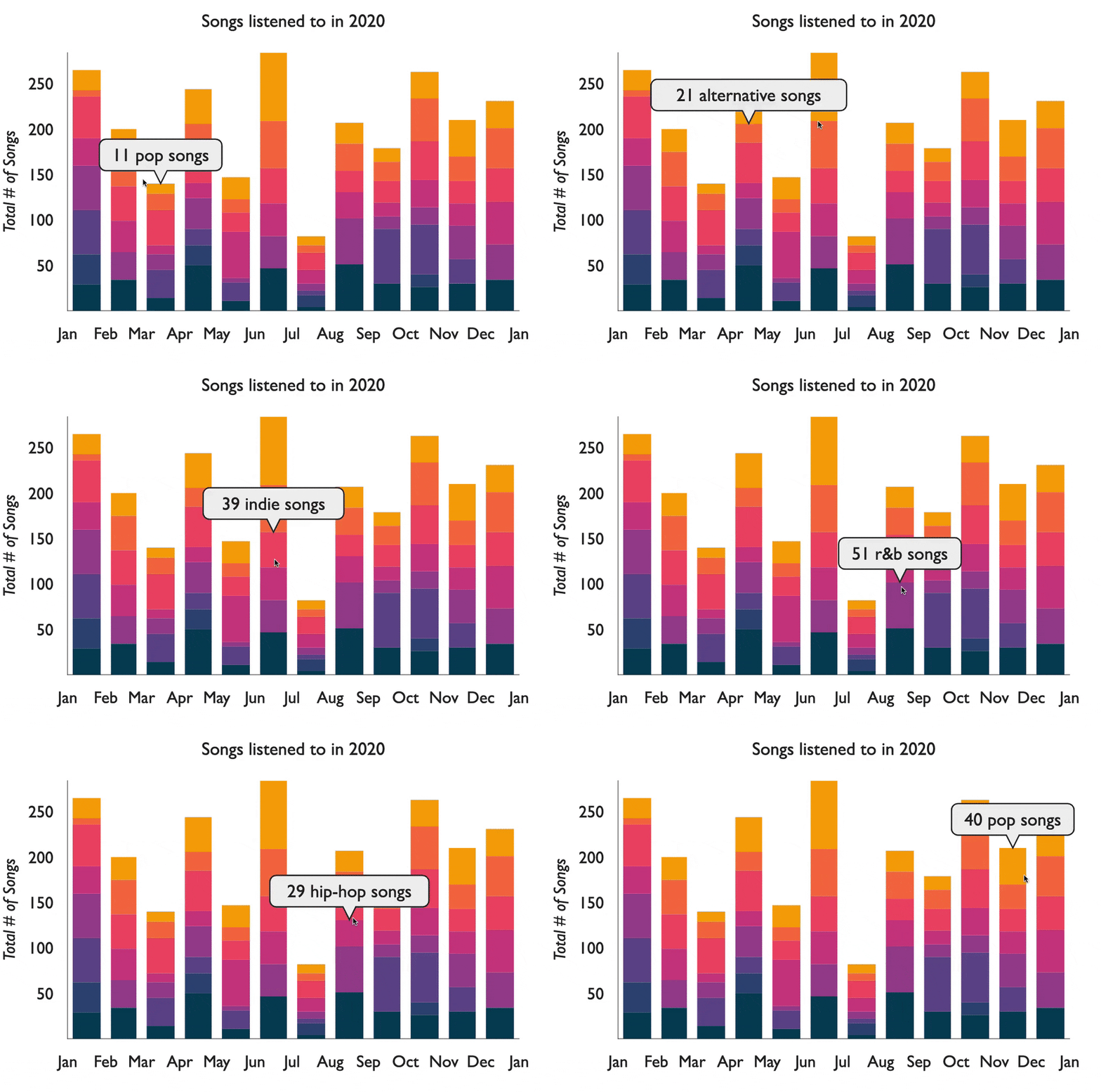
Lastly, we may want to add some tooltips so we can see the values of the data we are rendering. To do that we provide a containerComponent prop to VictoryChart. In this case we'll want to pass a VictoryVoronoiContainer component, which is used to associate a user's mouse position with the nearest data point. Then we add a labels prop to determine the text inside of the tooltip.
importdatafrom"./data.js";const groupedData = _.groupBy(data,({ genre })=> genre);const sharedAxisStyles ={tickLabels:{fontSize:13},axisLabel:{padding:39,fontSize:13,fontStyle:"italic"}};constApp=()=>{return(<VictoryChartscale={{x:"time"}}containerComponent={<VictoryVoronoiContainerlabels={({ datum })=> datum.y>0?`${datum.y}${datum.binnedData[0].genre} songs`:null}/>}><VictoryLabelx={225}y={25}textAnchor="middle"text="Songs listened to in 2020"/><VictoryStackcolorScale={["#003f5c","#2f4b7c","#665191","#a05195","#d45087","#f95d6a","#ff7c43","#ffa600"]}>{Object.entries(groupedData).map(([key, dataGroup])=>{return(<VictoryHistogramdata={dataGroup}x="day"binSpacing={8}style={{data:{strokeWidth:0}}}/>);})}</VictoryStack><VictoryAxistickCount={12}tickFormat={date=> date.toLocaleString("default",{month:"short"})}style={sharedAxisStyles}/><VictoryAxisdependentAxislabel="Total # of Songs"style={sharedAxisStyles}/></VictoryChart>);};
In our next Victory blog post, we'll be kicking off a new blog post series around building advanced sports visualizations with Victory, like the one shown below.
But wait - there's more.
Nearform publishes real-world learnings on data & AI, engineering, and digital strategy - with more merged in weekly.
Insights
Perspectives on AI in engineering, product development, and strategy, for enterprise executives.