Implementing Design Tokens in Workflows
Design tokens can be the ultimate standard for scaling your product design ecosystem for large-scale delivery processes.
When handing over designs to development, design tokens (in addition to the typical user-flows and prototype designs) can be the ultimate solution to eliminate the miscommunications that often arise in a typical design-to-development collaboration.
In this article, we’ll cover what design tokens are and how to implement them practically in your workflow.
What are design tokens?
Design tokens are unique identifiers given to various design values such as spacing, padding, typography, colours and animation. They are used to help construct and categorise a set of design attributes within a design system.
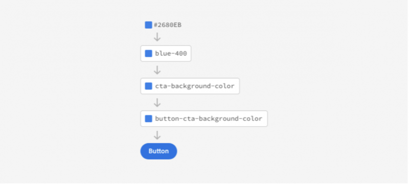
Below is an example of how to tokenise a colour for multiple uses.

These tokens give specific identifiers to design values and their various use cases. This makes it much easier to change globally, build a single source of truth in a design system and allow designers to communicate these specifics with developers.
Different types of design tokens
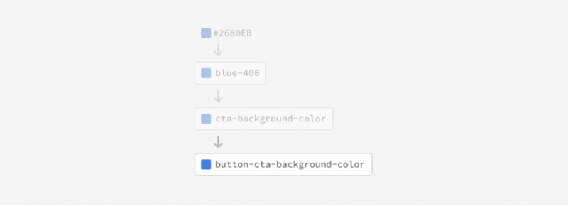
With the previous image in mind, we can break out our design tokens into three main tiers.
Tier 1: Global tokens

Global tokens are the base-level tokens we use to attribute a token value to other token tiers. These tokens are both context-agnostic (meaning the name does not reflect any use case context) and value-descriptive (meaning the name should reflect the value of that token).
Tier 2: Alias tokens

Alias tokens are the second tier of abstraction. They relate to a specific use case that helps communicate the intended purpose and gives context to a token. These tokens should be singular in their intended purpose, meaning they should relate only to one use case.
Tier 3: Component-specific tokens

These component-specific tokens combine the alias token with an extra use case description that identifies the purpose of the token. These tokens work well for communicating to developers where a token should be used.
How to implement design tokens
Multiple tools can help document, manage and export tokens for use in development. We can break these tool types into two categories — manual and semi-automatic.
Let’s take a look…
Manual
Manual processes can be slow and laborious at times, but they often provide more control and customisation than semi-automatic tools. There are some viable alternatives to a spreadsheet application for making the process much easier. Note: All of these manual tools assume you have a predefined design system and style guides in place to base your design tokens on.
Here are two we’ve picked to give you a taste of what can be achieved if you adopt the manual route:
Design Tokens Generator
Design Tokens Generator is an online application created by Gustavo Quinalha, a UX designer and front-end developer. This app provides a way to easily input your design tokens into predefined fields, which you can then export to SASS, JSON and HTML. Some benefits include:
- Free
- No subscription/account required
- Easy to use
- You can create custom token categories.
The primary drawbacks are that you cannot save your session or library online within the app, and there is no integration to publish your tokens on any repository or dev environment.
DesignTokens
DesignTokens is another online service that allows you to document, manage, export and publish design tokens.
Some highlights include:
- You can save your work online/in-app.
- It has a WYSIWYG interface that provides features including colour pickers.
- You can publish tokens to dev environments.
- It includes version control.
- It's NPM- and Yarn-compatible.
It’s free while in beta and, although it does require sign-up, it offers many powerful capabilities. Plus, Figma and Sketch plugins are promised — which we’re super excited about! One to watch.
Semi-automatic
Semi-automatic tools add some level of automation to the creation and management of design tokens. They can be faster to work with but, when compared with manual tools, they may have limitations relating to the environment they are used in and the level of customisability available.
Unlike the manual tools we discussed, none of these tools is stand-alone. All of the tools featured here require some design application. Given that Figma is the tool we use primarily at NearForm , that’s what we’ll base our findings on in relation to semi-automatic tools.
Let’s take a look...
Figma Tokens
Figma Tokens is a plugin for Figma created by Jan Six and Abdul Wahid.
It boasts some promising features that allow you to import your Figma styles to automatically create design token counterparts, which you can then export to JSON. It also syncs with another design token plugin called Arcade.
Some other useful features include the ability to create multiple themes, which you can turn on or off. It also allows for granular level typography values, with Figma text styles to be their own design tokens.
Sadly, as promising as all this sounds, it’s simply not quite there yet. It’s very buggy and does come with some major issues, including:
- Figma styles are not synced to styles within the plugin, which means changing a style in Figma does not affect the plugin, and vice-versa.
- If you change the name of a style in Figma and then import those updates to the plugin, it simply creates another style, instead of updating the existing related token.
- Changing themes seems to add background colours to our icon components.
- Changing themes only works on the same initial token, so if you create a new theme and import the same styles, you can’t select, say, a different colour in another theme; it automatically changes it for both themes.
- Auto-layout values such as padding and alignment are not available as tokens.
We hope these issues will be resolved soon, but this is definitely one to keep an eye on in the long term.
Toolabs Design System Manager
Toolabs Design System Manager is a Figma plugin created by Toolabs that acts both as a design system manager and as a design token manager.
It has a great WYSIWYG UI that syncs to your Figma styles and creates related tokens, which you can export to many output code sources, including CSS, Less, Sass, JSON, YAML, Js, Swift and Android.
Unlike the Figma Tokens plugin, it actually syncs to your Figma styles in real time, so if you change a style in the plugin it also changes the styles in Figma and vice-versa.
Some other great features include:
- The ability to create different themes for all values
- Theming for different screen widths
- The ability to tokenise all auto-layout values
- Ease of use
- No bugs (from what we can tell so far)
- Great export capabilities
The primary drawback we found was an absence of granular typography tokens that can be created individually (font-size, font-weights, line-height etc); it only captures Figma text style as a “pattern” and lumps all granular text styles into this pattern.
Toolabs Design System Manager is our top pick for a Figma semi-automatic tool.
Wrapping up
We have found no ultimate solution to solve all our design token needs. This goes for both designers and developers and for how we get from visual designs to code via repositories such as Github. All tools available require considerable manual configuration in some form or another. We’d love to see an app/plugin that could unite devs and designers with a common language and allow for synced communication between dev and design environments.
Two of the most common industry standards we see devs use are:
However, for designers, one of the main issues is that Figma and other design apps currently don’t support or provide any real in-app solutions for design-token management. So it’s been solely down to third parties to bridge the gap and find solutions, which generally only cater to some limited, specific need.
It’s great to see these new tools come to the forefront in the design and development industry, and we are really excited to see how these and other tools evolve as the demand for a design-token solution continues to grow.
Insight, imagination and expertly engineered solutions to accelerate and sustain progress.
Contact