Centralized, editable style guides that serve as a single source of truth
Save time, money, and effort by standardizing the design system across all teams

Create a style guide that can be used across all teams
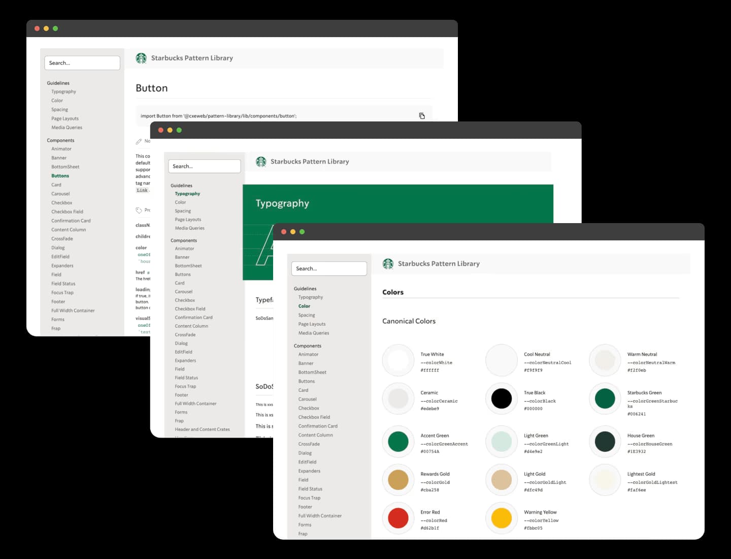
Ideally, all the teams within an organization as large as Starbucks would share a design language that is consistent throughout each and every place it’s being used. Our design team came on to create a style guide that can be used across all teams using React.js to keep branding up-to-date and consistent with less time and effort.

Understand the scale of the problem to scope a realistic solution
The process began with an audit—we needed to hunt down the inconsistencies and measure the payload they were adding to the websites. We worked closely with the designers on a global and individual level to help standardize and document different designs and common components in order to create the style guides.
A React-based solution
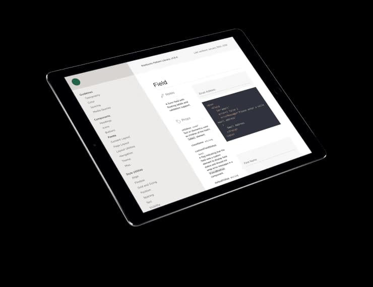
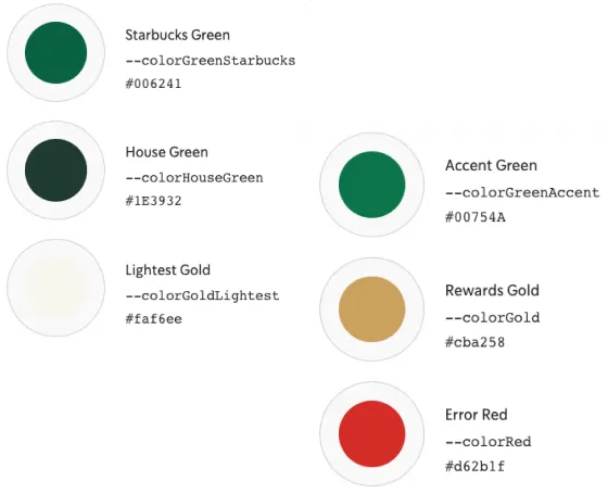
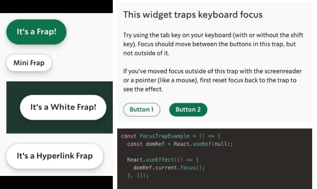
Using React, we were then able to take the different UI components, such as UI button tags, and create standardized, abstracted APIs for each one. In doing so, all of the boilerplate and implementation details were transformed into a clean, easy-to-use developer interface. Now, when a UI component is improved in the pattern library, it will be updated across the board and will work for all of the other teams who use that attribute, without any additional effort.
Scalable style guides
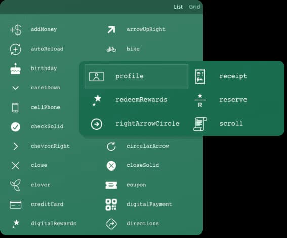
Creating reusable style code with reusable components created a more consistent user experience, simplified the code base, and saved many of hours spent maintaining and creating new-but-shouldn’t-be-new components. These kinds of tools ensure uniformity, simplicity and efficiency across all the teams
Expansion across teams
The style guides we created were so successful that they spread beyond the teams that we assisted directly. New teams began to use them on their projects, and even vendors building one-off projects were able to use and contribute to the them.
Consistency drives progress
In addition to the time, money, and effort saved by the implementation of these style guides, the companies both left the project with a great public example of their approach to the modern web. Thanks to the style guides created, Starbucks is producing apps with consistent branding all while saving time, money, and effort.
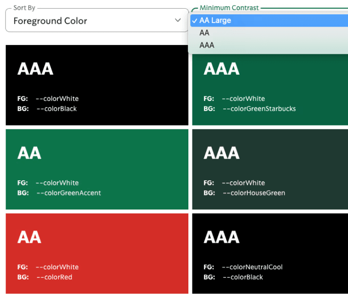

A style code simplified the code base and saved hundreds of hours for engineering teams going forward
We took a multiple-step cohesive approach to Starbucks’ library problem. We audited inconsistencies and measure the payload they add to the websites. Then we standardized and documented different designs and common components. We used React to take different UI components, such as UI button tags, and create standardized, abstracted APIs for each one. Finally we create a clean, easy-to-use developer interface. This measured, well-executed process allowed us to construct a solution that Starbucks would need for many apps to come.
You may also like

Starbucks ordering and store locator progressive web app
Insight, imagination and expertly engineered solutions to accelerate and sustain progress.