Exploring React Portals
Portals receive first-class official support in React
With the recent release of React v16 , there are a number of exciting new features. One of these new features is called Portals . Portals have been a concept in the React community for quite some time 1 and have gained first-class official support. The React docs define a Portal as > Portals provide a first-class way to render children into a DOM node that exists outside the DOM hierarchy of the parent component. To best illustrate why this might be useful and necessary, let's take a look at two examples: - Modals - Legacy Applications
Modals
A modal is a UI element that overlays on top of the main window of an application.
Let's build an application with a simple modal 2 to illustrate how this works:
To start, create a new application using create-react-app . If you have never used create-react-app before, run this command to install:
npm install -g create-react-appand then:
import React, { Component } from 'react'
import './Modal.css'

class Modal extends Component {
  render() {
    return this.props.open ? (
      <div>
        <div className="modal-background" />
        <div role="dialog" className="modal-dialog">
          <header>
            <span>{this.props.header}</span>
            <button
              onClick={() => this.props.onClose()}
              type="button"
              aria-label="close"
            >
              CLOSE
            </button>
          </header>
          <div className="modal-content">{this.props.children}</div>
        </div>
      </div>
    ) : null
  }
}

export default Modal
and the corresponding styles in a new file called Modal.css in src/
.modal-background {
  position: fixed;
  top: 0;
  left: 0;
  bottom: 0;
  right: 0;
  background-color: rgba(33, 33, 33, 0.85);
  z-index: 1000;
}

.modal-dialog {
  position: fixed;
  top: 20%;
  left: 10%;
  right: 10%;
  bottom: 20%;
  text-align: center;
  background-color: rgba(250, 250, 250, 1);
  box-shadow: 0px 0px 10px 0px rgba(0, 0, 0, 0.75);
  z-index: 1001;
}

.modal-dialog > header {
  background: #217cba;
  color: #fff;
  display: flex;
  align-items: center;
  justify-content: space-between;
  font-size: 2rem;
  padding: 0 2rem;
  min-height: 50px;
}

.modal-dialog > header > button {
  border: none;
  padding: 0;
  font-size: 1.2rem;
  background: inherit;
  color: white;
  cursor: pointer;
}
Next, update App.js with a basic button to toggle the <Modal /> component:
import React, { Component } from 'react'

import Modal from './Modal'
import logo from './logo.svg'

import './App.css'

class App extends Component {
  state = {
    showModal: false
  }

  render() {
    const { showModal } = this.state

    return (
      <div className="App">
        <header className="App-header">
          <img src={logo} className="App-logo" alt="logo" />
          <h1 className="App-title">Welcome to React</h1>
        </header>
        <div className="sidebar">
          <button
            className="btn show-modal"
            onClick={() =>
              this.setState({
                showModal: !showModal
              })}
          >
            Show Modal
          </button>

          <Modal
            header="My Modal"
            open={showModal}
            onClose={() =>
              this.setState({
                showModal: false
              })}
          >
            <h1>Some Content</h1>
          </Modal>
        </div>
      </div>
    )
  }
}

export default App
and add the following css to src/App.css :
...existing styles generated from create-react-app

.btn {
  margin: 5px 0;
  padding: 10px;
  font-size: 1.5rem;
  border: 0;
  box-shadow: 0 8px 6px -6px #bdbdbd;
  cursor: pointer;
}

.show-modal {
  background: #1e874b;
  color: #fff;
}

.sidebar {
  display: flex;
  flex-direction: column;
  margin: 25px 0;
  padding: 50px 10px;
  min-height: 50vh;
  width: 40vw;
  border: 1px solid lightgray;
  box-shadow: 13px 8px 6px -6px lightgrey;
  background: #f5f5f5;
}
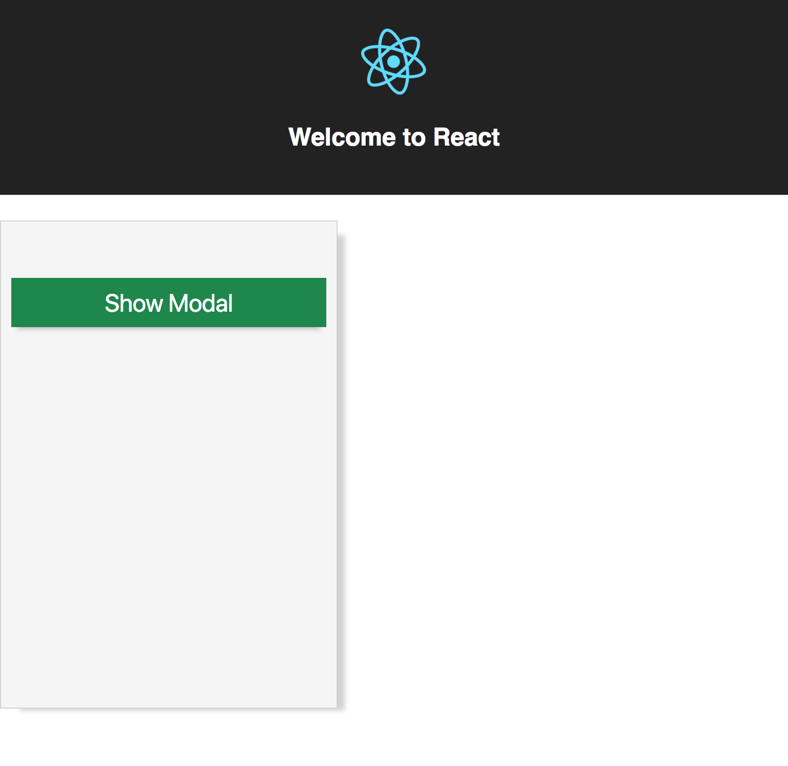
Now viewing the page in the browser, it should look like this:
Clicking on the Show Modal button displays our <Modal /> component:
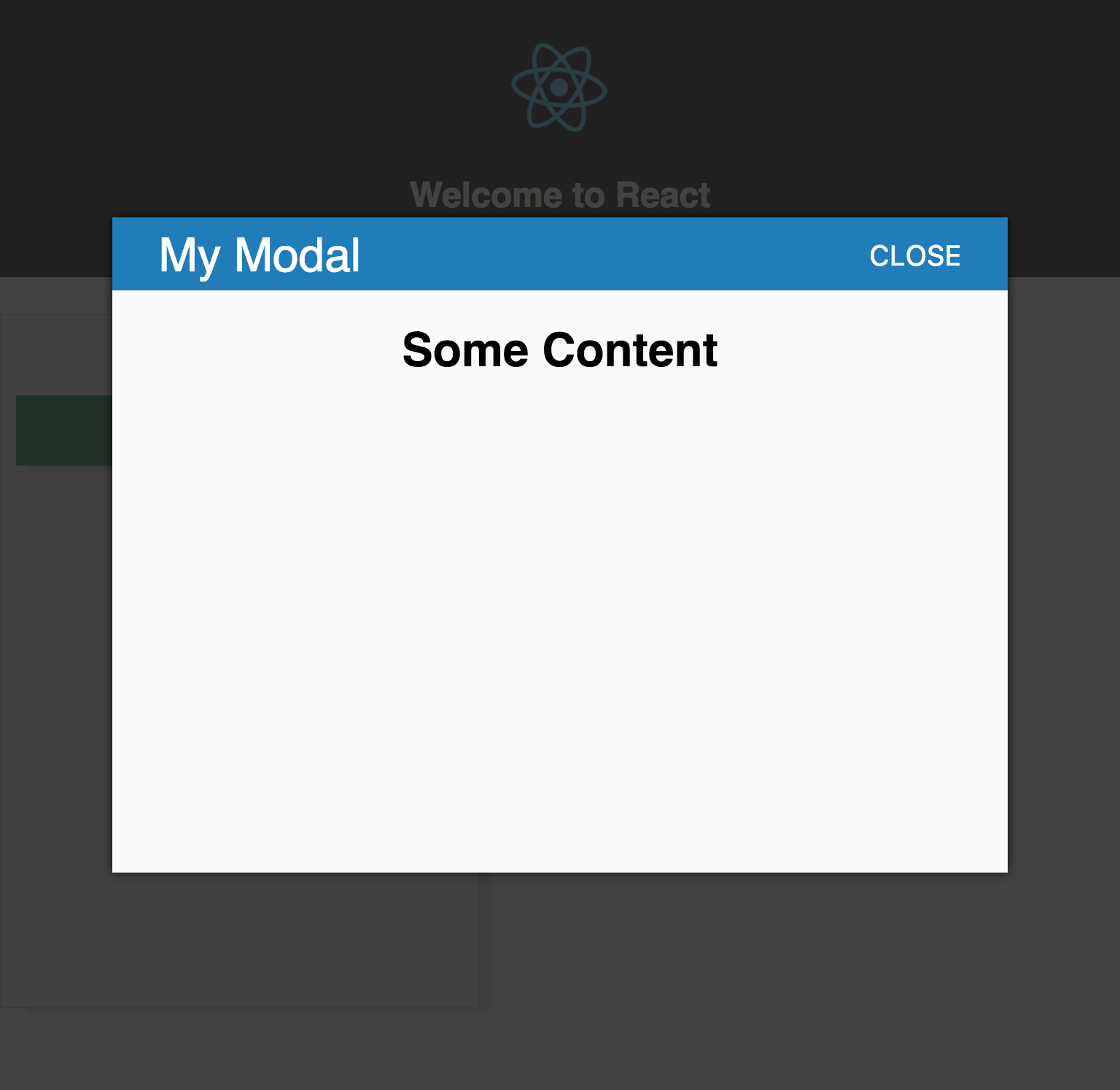
Awesome! The modal renders successfully as expected! The sidebar takes up a big chunk of the screen, wouldn't it be nice to have the sidebar slide in and out? Let's go ahead and make that change:
import React, { Component } from 'react'

import Modal from './Modal'
import logo from './logo.svg'

import './App.css'

class App extends Component {
  state = {
    showModal: false,
    showSidebar: false
  }

  render() {
    const { showModal, showSidebar } = this.state

    return (
      <div className="App">
        <header className="App-header">
          <img src={logo} className="App-logo" alt="logo" />
          <h1 className="App-title">Welcome to React</h1>
        </header>
        <div>
          <button
            className="toggle-sidebar btn"
            onClick={() => this.setState({ showSidebar: !showSidebar })}
          >
            Toggle Sidebar
          </button>
        </div>
        <div className={showSidebar ? 'sidebar hide' : 'sidebar'}>
          <button
            className="btn show-modal"
            onClick={() =>
              this.setState({
                showModal: !showModal
              })}
          >
            Show Modal
          </button>

          <Modal
            open={showModal}
            header="My Modal"
            onClose={() =>
              this.setState({
                showModal: false
              })}
          >
            <h1>Some Content</h1>
          </Modal>
        </div>
      </div>
    )
  }
}

export default App
We added a new state property called showSidebar which will toggle the sidebar open and closed. To make this work, we will have to update our App.css file to use the translate transform to slide the div in and out of the screen:
...add to existing styles

.toggle-sidebar {
  background: #ffeb3b;
  color: #686868;
}

.sidebar.hide {
  transform: translate(-110%);
}

.sidebar {
  ... existing .sidebar styles transform: translate(0);
  transition: 0.5s linear;
}
Now if we load up the page, we'll see the new yellow button called Toggle Sidebar . Clicking the toggle button should now do what we expect, animating the sidebar left off the screen and with another click, moving the sidebar back to it's original location.
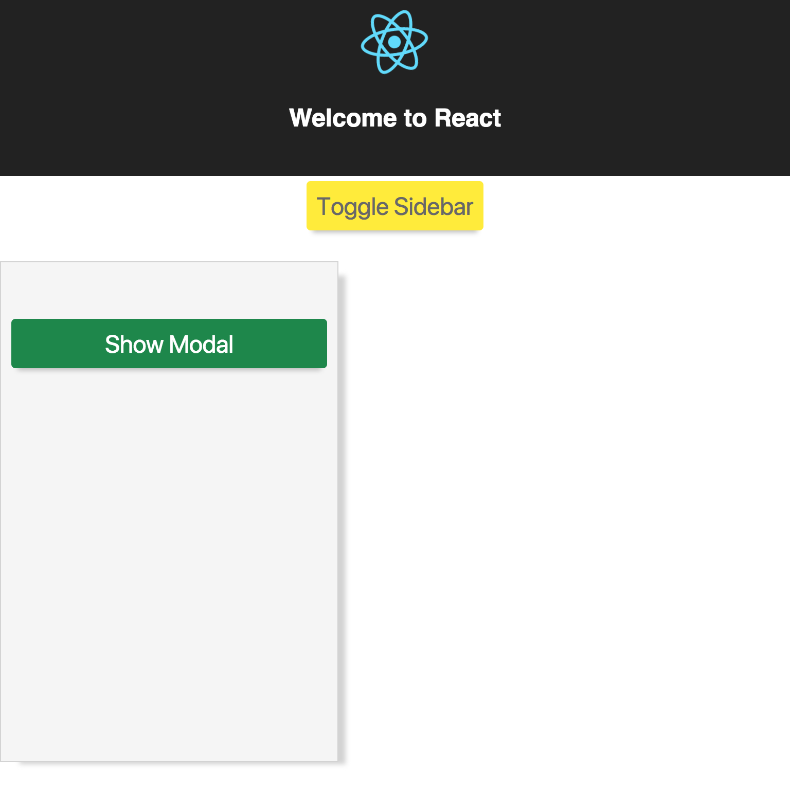
Excellent, now with the sidebar open, let's click Show Modal to ensure everything is still working correctly.
Oh no! Our <Modal /> component is now broken. How did this happen?
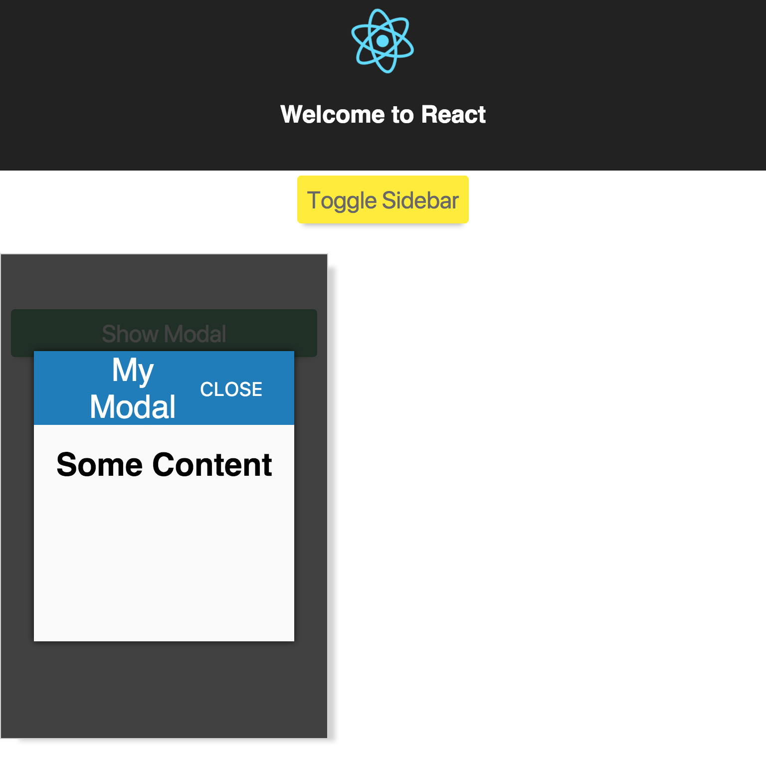
Let's dig in and figure out how this happened! We used position:fixed to position our modal relative to the viewport of the browser. This solution works but it has a major flaw. position:fixed works, but with an important caveat.
Here is the documentation from MDN on the position fixed property : fixed > The element is removed from the normal document flow; no space is created for the element in the page layout. Instead, it is positioned relative to the screen's viewport and doesn't move when scrolled. Its final position is determined by the values of top, right, bottom, and left. This value always creates a new stacking context. When an ancestor has the transform or perspective property set to something other than none, that ancestor is used as the container instead of the viewport (see CSS Transforms Spec). In printed documents, the element is placed in the same position on every page.
Looking at our HTML, we see that our modal is nested inside of our sidebar container:
<div class="App">
  <header class="App-header">
  ...header content
  </header>
  <div class="sidebar">
    <button class="btn show-modal">Show Modal</button>
    <div>
      <div class="modal-background"></div>
      <div role="dialog" class="modal-dialog">
      ...modal content
      </div>
    </div>
  </div>
</div>
Adding the transform property to the sidebar changed our fixed position from the viewport to the sidebar container! This means the styling of the <Modal /> component can be broken by any styles set on the parent, which puts a damper on the re-usability of the component. Should we just remove the transform in the sidebar? That would solve the issue but makes the <Modal /> component brittle to work with. We really want to maximize re-use and want the <Modal /> component to work completely isolated from any styles set on any parent components.
What if there was a way to always render our component from the same location, say inside the <body> of our HTML? We could then consistently style the component without worrying about the parent components styles.
How can we do this in our React application? Aren't all components encapsulated under a root component when ReactDOM.render is called?
This is the problem Portals aim to solve. To see a Portal in action, let's first add a new div inside of public/index.html called root-modal right before the closing </body> tag.
<body>
  ...
  <div id="root-modal"></div>
</body>
Next, let's create a new file called src/Portal.js :
import React from 'react'
import ReactDOM from 'react-dom'

import Modal from './Modal'

class Portal extends React.Component {
  constructor(props) {
    super(props)

    this.rootSelector = document.getElementById('root-modal')
    this.container = document.createElement('div')
  }

  componentDidMount() {
    this.rootSelector.appendChild(this.container)
  }

  componentWillUnmount() {
    this.rootSelector.removeChild(this.container)
  }

  render() {
    return ReactDOM.createPortal(<Modal {...this.props} />, this.container)
  }
}

export default Portal
React.createPortal expects two arguments, the first being the Component you want rendered (in this case our <Modal /> component) and the second being a DOM element ( this.container in our example). In componentDidMount we manually append the element into the DOM and on componentWillUnmount , the element is removed from the DOM.
In App.js , let's add code to display our new <Portal /> component alongside the <Modal /> component:
import React, { Component } from 'react'

import Modal from './Modal'
import Portal from './Portal'
import logo from './logo.svg'

import './App.css'

class App extends Component {
  state = {
    showModal: false,
    showSidebar: false,
    showPortal: false
  }

  render() {
    const { showModal, showSidebar, showPortal } = this.state

    return (
      <div className="App">
        <header className="App-header">
          <img src={logo} className="App-logo" alt="logo" />
          <h1 className="App-title">Welcome to React</h1>
        </header>
        <div>
          <button
            className="toggle-sidebar btn"
            onClick={() => this.setState({ showSidebar: !showSidebar })}
          >
            Toggle Sidebar
          </button>
        </div>
        <div className={showSidebar ? 'sidebar hide' : 'sidebar'}>
          <button
            className="btn show-modal"
            onClick={() =>
              this.setState({
                showModal: !showModal
              })}
          >
            Show Modal
          </button>

          <button
            className="btn show-portal"
            onClick={() =>
              this.setState({
                showPortal: !showPortal
              })}
          >
            Show Portal
          </button>

          <Modal
            open={showModal}
            header="My Modal"
            onClose={() =>
              this.setState({
                showModal: false
              })}
          >
            <h1>Some Content</h1>
          </Modal>

          <Portal
            open={showPortal}
            header="My Portal Modal"
            onClose={() =>
              this.setState({
                showPortal: false
              })}
          >
            <h1>Some Portal Content</h1>
          </Portal>
        </div>
      </div>
    )
  }
}

export default App
and the corresponding css in App.css :
...existing styles

.show-portal {
  background: #673ab7;
  color: #fff;
}
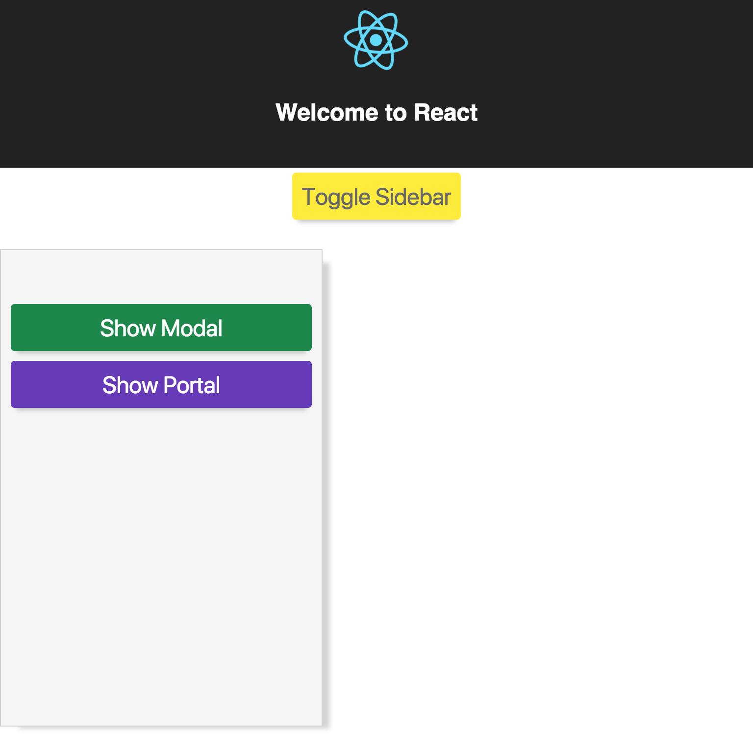
There should be a new button called Show Portal below the Show Modal button:
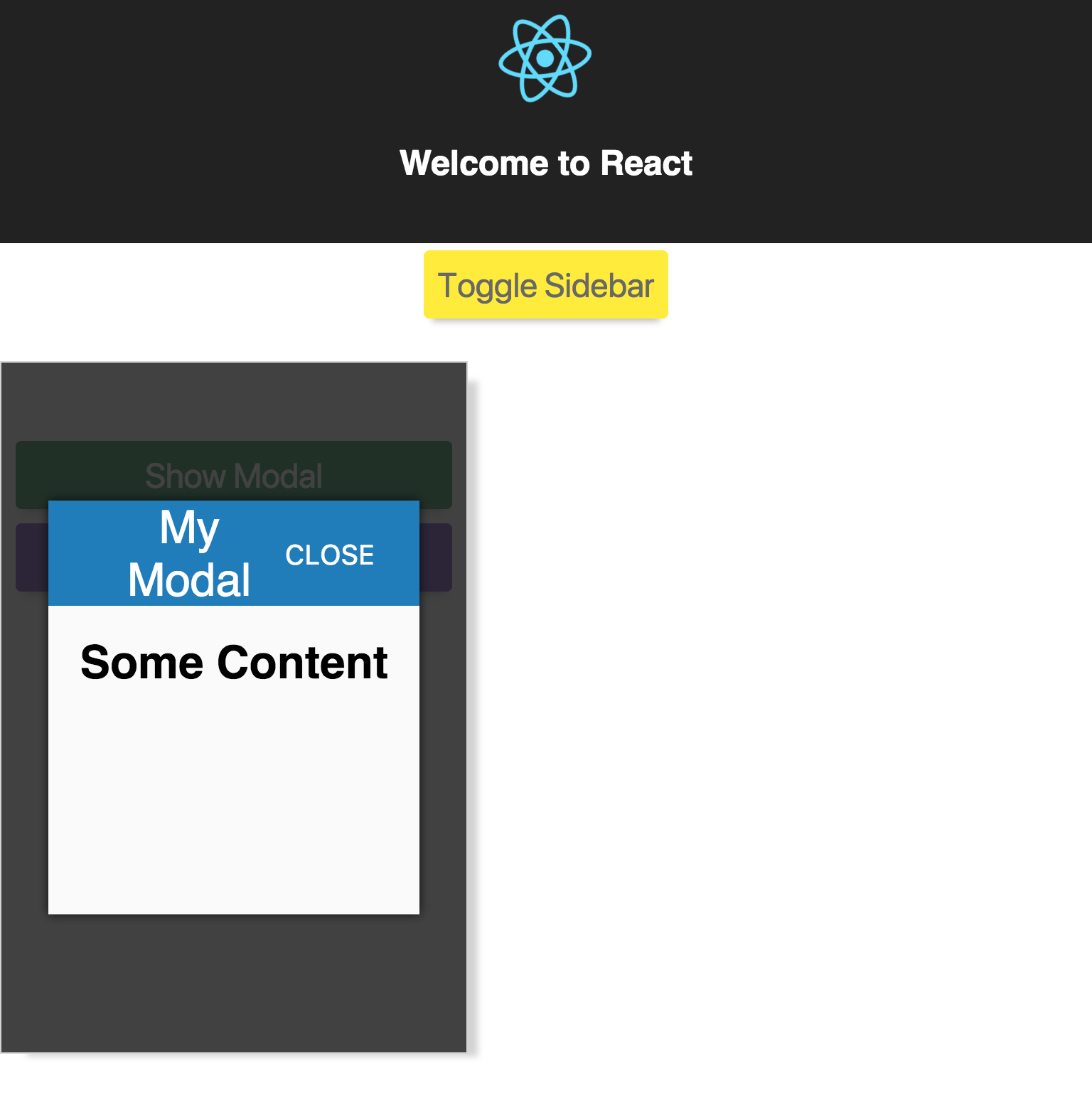
When clicking Show Modal , the application should still appear broken, as transform is still set on the sidebar.
After clicking CLOSE , click on Show Portal .
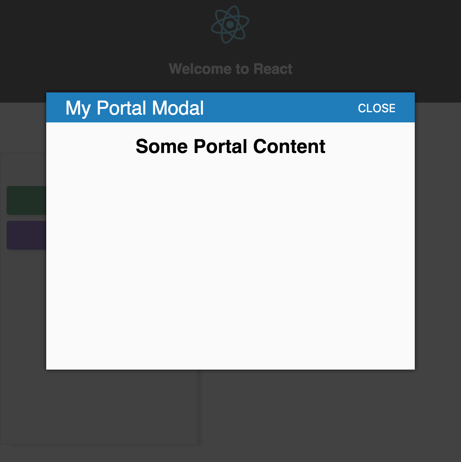
Success! Our <Modal /> component is back to normal. To see why, let's examine the HTML:
<div class="App">
...App Content
</div>

<div id="root-modal">
  <div>
    <div>
      <div class="modal-background"></div>
      <div role="dialog" class="modal-dialog">
        <header>
          <span>My Portal Modal</span>
		  <button type="button" aria-label="close">CLOSE</button>
        </header>
        <div class="modal-content">
          <h1>Some Portal Content</h1>
        </div>
      </div>
    </div>
  </div>
</div>
Notice how the <Modal /> is rendered completely outside our <App /> component. This means that regardless of the styling of our <App /> component, it will not break the <Modal /> component.
The other thing to note is that no changes were made to our original <Modal /> component to get it working. The Portal takes props like any other component.
Legacy Applications
Let's say you have inherited a legacy application that is looking to add some new features and your team has decided to utilize React to build out those features. The components were built by your teammates and provided to you. Your job is to integrate them into the existing application.
The two components are:
- An interactive
<Profile>component that will display in the header. - A customer support
<Chat>component that opens a window in the bottom right corner of the viewport.
The <Profile> component will need to render to the top header and the <Chat> component will need to render to a <div> right before the closing </body> , since we learned that position:fixed cannot be trusted. Both components require certain user data to be passed into the component to work. This data is returned from an API endpoint called /user/<userId> . This means there is some shared state between the components.
One approach might be to load the user information on the server and write it to the HTML, say window.__USER_INFORMATION__ , and then when the client loads up the page, read the variable window.__USER_INFORMATION__ and pass that into each component when calling ReactDOM.render
const userInformation = window.__USER_INFORMATION__;

ReactDOM.render(<Profile user={userInformation} />, document.getElementById('root-profile'))
ReactDOM.render(<Chat user={userInformation} />, document.getElementById('root-chat'))
Great, job done! But wait, you run the code and find out that the endpoint is quite slow. Due to these performance issues, you are now asked to make the request to the endpoint on page load instead of writing the data out to a global variable. We do not want to "over-fetch" data, so the user endpoint should only be called once. How can we render two components to different areas of the DOM, but continue to share some state between each component?
This is another use case where Portals can help us out
Just as before, we can create a Portal component for each component as we did before.
class ProfilePortal extends React.Component {
  constructor(props) {
    super(props)

    this.rootSelector = document.getElementById('root-profile')
    this.container = document.createElement('div')
  }

  componentDidMount() {
    this.rootSelector.appendChild(this.container)
  }

  componentWillUnmount() {
    this.rootSelector.removeChild(this.container)
  }

  render() {
    return ReactDOM.createPortal(<Profile {...this.props} />, this.container)
  }
}
and create a new component to render to the DOM:
class App extends React.Component {
  state = {
    userInformation: null
  }

  componentDidMount() {
    ... make request to server and call setState
  }

  render() {
    const { userInformation } = this.state

    return (
      <div>
        <ProfilePortal user={userInformation} />
        <ChatPortal user={userInformation} />
      </div>
    )
  }
}
Then to mount the application:
ReactDOM.render(<App />, document.getElementById('root'))Instead of having to manage the rendering of each component, there is now a single component to manage the rendering with some shared state, which in turn renders to two disparate parts of the DOM! If more components were added in the future, it's as easy as creating a new portal and rendering it in the <App /> component.
If the legacy application was ever converted to be a full-fledged React application, then the Portal components can be removed and the <Profile> and <Chat> can remain untouched. This provides a very maintainable path going forward.
Summary
Portals provide a nice escape hatch to render components outside of the DOM hierarchy, while maintaining a consistent API that feels like any other React component. While this escape hatch could lead to potential misuse and problematic code, React Portals provide an indispensable tool for building and maintaining applications in both new and legacy systems.
More Articles on React
- How to use GraphQL in React using hooks
- Speeding up React SSR: Announcing ESX
- Animation in React
- Say Hello to React Browser Hooks
- Forget Everything you Learned about React – Hooks Rock!
- Managing React State with Render Props
- Exploring React Portals
- Sharing React Components with Lerna
- React Components Living Style Guides Overview
Footnotes
1 Portals were built using ReactDOM.render directly on a separate container or using ReactDOM.unstable_renderSubtreeIntoContainer
2 This modal is a trivial example to illustrate how to use Portals . When building a modal for production, it is important to follow all accessibility guidelines or leverage an existing modal library that has first-class accessibility support.
Insight, imagination and expertly engineered solutions to accelerate and sustain progress.
Contact