React Components Living Style Guides Overview
An in-depth look at React Components Style Guides
React components style guides are a type of "living pattern library", where the components are rendered using production code and enable interactivity and live configuration.
For many years style guides have been used as a primary platform of communication between designers and developers working on any complex project. Usually it has been a separate resource that breaks down the user interface to organized building blocks and serve as a reference to locate and define design patterns for the project.
The problem with this approach is that we have to maintain the code in two different places: the guide itself and the actual production codebase. And unfortunately the style guide consistency is the first to be sacrificed when it comes to hotfixes and tight deadlines.
This approach comes in handy on every stage of the project and for anybody in a cross-functional team.
- It allows designers to easily stay abreast of the existing state of UI elemens
- It allows develeopers and QA engineers to use it as a playground to develop, mantain and test components in isolation
- It allows product owners to have a global overview of the design an implentation
The larger the team and the more complex the codebase, the more beneficial it is to have one source of reference when working on the UI components. This is especially true when it comes to modern frontend development, such as React applications, that can easily end up with hundreds or thousands of UI components and complex hierarchies.
Let's have a look at some of the most interesting projects that provide the tools to easily create and configure living style guides out of your existing React codebase.
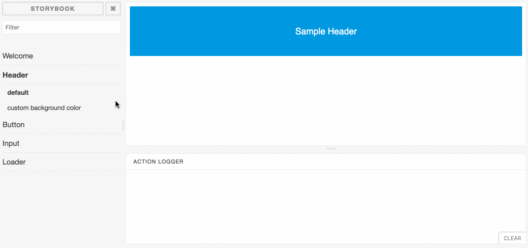
Storybook
Docs & demo: https://storybook.js.org/ Github: https://github.com/storybookjs/storybook

Storybook is the most popular pattern library creation tool. It has become even more popular since the release of version 3.0 which added support for Webpack 2.0 and snapshot testing.
Initial setup is quite straightforward and consists of the creation of definitions (stories) for each component with the corresponding state in a similar manner to the visual test cases:
import React from 'react';
import { storiesOf } from '@storybook/react';

import MyComponent from './MyComponent';

storiesOf('MyComponent', module)
  .add('default', () => <MyComponent />)
  .add('custom size', () => <MyComponent size="large" />);
Once the story is ready the next step is to define its path in the Storybook configuration file at .storybook/config.js :
import { configure } from '@storybook/react';

function loadStories() {
  require('../stories/index.js');
  // You can require as many stories as you need.
}

configure(loadStories, module);
The popularity of Storybook comes from its powerful Addons that complement basic functionalities. The most significant are natively supported by the platform, e.g. Actions - to inspect events, Links - to bind the stories together or Knobs - to dynamically edit element props. Apart from that there are several useful community plugins that help with creating props combinations, internationalization, improving components organization, versioning, to name just a few. You can see the more complete list of available Addons and check the API reference here .
PROS:
- Project maturity and active community
- Straightforward to setup and maintain
- Hot module reload (even for functional stateless components)
- Support for React Native components, CSS, images and other static files
- Allows to inspect events related to your components
- Allows to edit React props dynamically using the Storybook UI
- Integrates Jest snapshot testing for all stories
- Possibility for further customization via Addons API
CONS:
- Missing support for deeper level hierarchy by default
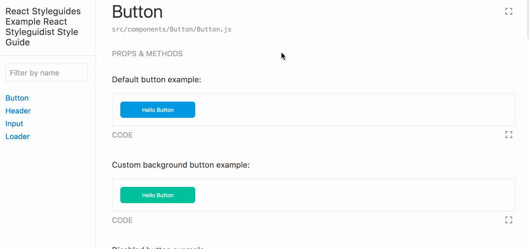
React Styleguidist

React Styleguidist requires even less initial configuration since it directly parses the source files (using react-docgen ) and generates documentation based on PropTypes or Flow annotations. It uses Markdown to define specific components and by default searches for and parses the Readme.md or ComponentName.md files in the components folder.
Typical element definition can look as simple as this:
```
<MyComponent size="large" />
```
Furthermore the library supports JSDoc tags when documenting components (e.g. @author , @version , @deprecated ), which in combination with proper comments and propTypes declarations can help with providing as much complete information as possible:
/**
 * The component description
 *
 * @version 1.0.1
*/
class MyComponent extends Component {
  static propTypes = {
    /**
     * The color for the component
     */
    color: PropTypes.string,
    /**
     * The size of the component
     *
     * @since Version 1.0.1
     */
    size: PropTypes.oneOf(['small', 'normal', 'large'])
  };
  ...
}
All the other custom configuration can be defined in the styleguide.config.js file, which can include specific categories and sections, third-party library integrations, custom component path pattern (other than the default src/@(components|Components)/**/*.{js,jsx} ) or easy to setup visual customization and theming.
PROS:
- Automatically finds components definitions
- Hot module reload
- Ability to switch between general components view and their isolated scopes
- Clear overview of the components props, including their default values and description
- Easy to exclude unwanted props or control which methods have to be visible in the documentation
- Support for JSDoc tags when documenting components
- Support for such libraries as Redux, Relay, styled components and CSS modules
CONS:
- Missing option to live change component props
BlueKit

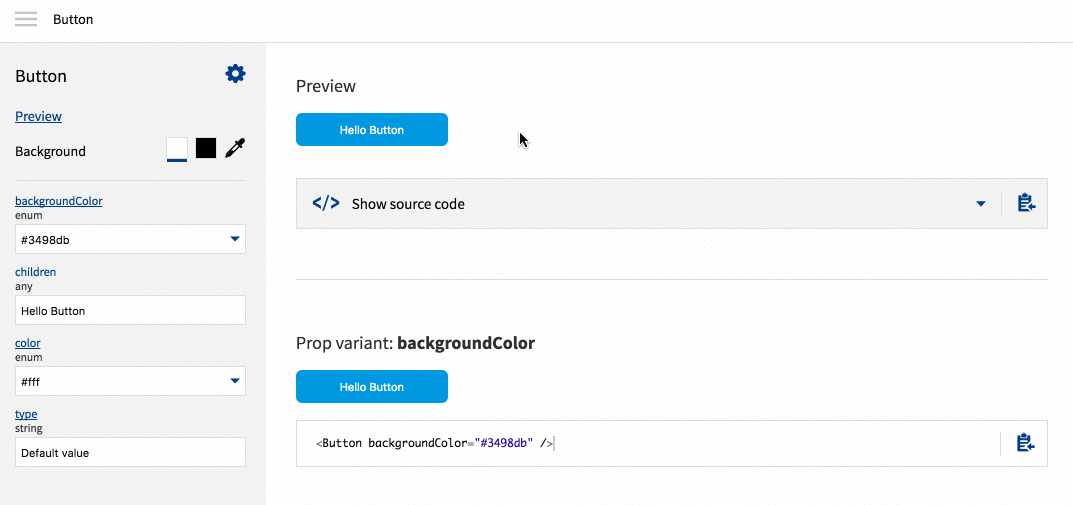
BlueKit's most powerful feature is a robust live preview with editable source.
It not only dynamically creates the components library from the specified path, but analyzes all the information included in the propTypes and generates a set of UI controls to ease props manipulation respective to its type.
The library configuration is stored automatically in the componentsIndex.js file on the root of the project that you reference from any route in your application to display the documentation:
import React, { Component } from 'react';
import BlueKit from 'react-bluekit';
import componentsIndex from './components/componentsIndex';

export default () => {
  return (
    <BlueKit
      componentsIndex={componentsIndex}
      name="MyStyleGuide" // optional
    />
  );
}
By default BlueKit generates a set of component variations using a random combination of props.
In some cases it can be useful to enforce more precise declarations (e.g. using PropTypes.oneOf(...) method) to prevent unwanted behaviour.
If you want to have more control on the final look of the documentation you can edit the components definition in the componentsIndex.js file:
MyComponent: {
  name: 'MyComponent',
  menu: 'MyComponent',
  file: './MyComponent/index.js',
  component: MyComponent,
  componentName: 'My Component',
  description: 'Sample component description',
  customProps: {},
  propsDefinition: {
    color: {
      type: {
        name: "string"
      },
      required: false,
      description: "",
      defaultValue: {
        value: "'#fff'",
        computed: false
      }
    }
  },
  simpleProps: {
    color: "#fff"
  },
  fullProps: {
    color: "#fff"
  }
}
PROS:
- Hot module reload
- TypeScript support - BlueKit uses react-docgen-typescript parser for
.tsxfiles - Preview includes global components list and separate views in isolation
- Useful UI features like background color invert or color picker
- Very easy props manipulation (input types are generated according to propTypes)
- Creates a set of random variations of each component by default
- The props that dont affect the components look are automatically hidden
CONS:
- Lack of support for variables in
defaultProps - Styled and connected components are not supported yet
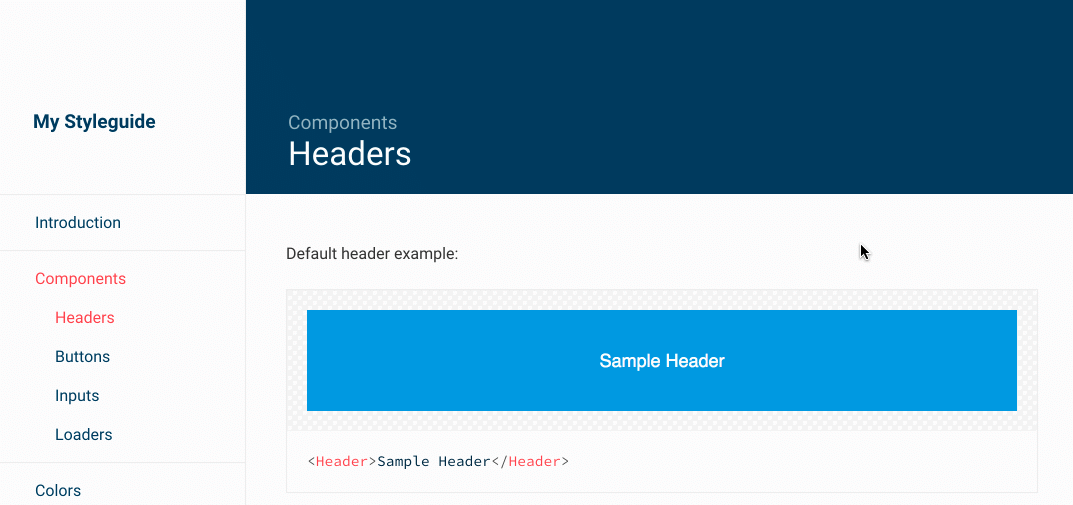
Catalog

Catalog is the only tool on the list that wasn't created primarily with React in mind. However, it is already a mature project with an established community, and just recently added support for React components.
That makes it work effortlessly regardless of the technology being used or type of components and items we want to document, e.g. standalone code blocks, color palettes, typography, static files, etc.
Documentation is generated by rendering the Catalog component supplied with a set of component pages definitions:
import React from 'react';
import ReactDOM from 'react-dom';
import { Catalog } from 'catalog';

import MyComponent from './MyComponent';

ReactDOM.render(
  <Catalog
    title='My Style Guide'
    pages={[
      {
        imports: { MyComponent },
        path: '/',                            // The path where the page can be accessed
        title: 'My Component',                // The page title
        src: require('./docs/MyComponent.md') // Path to the markdown definition
      },
      // Other pages ...
    ]}
  />,
  document.getElementById('app')
);
The component definitions are handled primarily as Markdown code blocks, also referred as specimen blocks, denoted with corresponding type, e.g. react, color-palette, image, download (see full list of supported types here).
```react
<MyComponent size=large />
```
Note: in case of React components without complex configuration you can reference them directly in the page object definition in the following way:
{
  path: '/',
  title: 'My Component',
  component: MyComponent
}
PROS:
- Flexibility in documenting different types of UI elements
- Specimens are easy to setup and configure
- Support for styled components
- Provides internal
configureRoutesmethod which is more flexible when defining and combining routes, using them for server-side rendering, etc.
CONS:
- Lack of support for hot module reload by default
- Less out-of-the-box handling react components, requires more manual work
Other approaches
The tools listed above are the easiest to configure and have the most features. However, there are a couple of similar projects worth mentioning such as React Styleguide Generator , React Style Guide , Carte Blanche , Atellier and React Cosmos . The last two have the powerful component playground features. There is also a Styleguidist plugin for a SourceJS style guide engine which allows for an easy integration with React components. From a designer perspective the most worthy of mention is React Sketch.app library which allows you to write React components which render to Sketch documents.
If none of the existing solutions listed above matches your project's expectations, why not create your own tool?
The easiest approach would be to define a higher-order component that renders given elements together with the representation of its raw markup. To implement more sophisticated features, such as automatic component detection and props analysis we could use react-docgen which parses not-transpiled source files, finds exported React components and generates documentation based on propTypes.
As we saw in the previous examples Markdown is the most straightforward way to represent element definitions, thus we could extract the code blocks using any markdown processor (e.g. Remark ) and render them as an interactive playground with a code editor tool such as CodeMirror or ACE .
Conclusion
Style guide driven design and development seems to be extremely helpful for the maintenance of any modern frontend applications.
Of the tools highlighted in this article Storybook seems to be a step ahead of the others, primarily because of the strong community and the powerful Addons API. We strongly recommend that you test the other ones as they might be a better match depending on your project requirements.
To help with the comparison we created this repository where you can see the most popular libraries in action.
Learn more about our Enterprise React Design services .
Looking for more about React and React Components? Check out these articles
- How to use GraphQL in React using hooks
- Speeding Up React SSR with ESX: Tech Talk Video
- Speeding up React SSR: Announcing ESX
- Animation in React
- Say Hello to React Browser Hooks
- Forget Everything you Learned about React – Hooks Rock!
- Managing React State with Render Props
- Exploring React Portals
- Sharing React Components with Lerna
Insight, imagination and expertly engineered solutions to accelerate and sustain progress.
Contact