Figma’s new Grid auto-layout: What it does (and doesn’t yet do)Figma’snewGridauto-layout:Whatitdoes(anddoesn’tyetdo)Figma’snewGridauto-layout:Whatitdoes(anddoesn’tyetdo)
Barret Anspach
27 Jun 2025
Share
We share the things you can expect from Figma’s new Grid auto-layout mode
Since the introduction of Row and Column auto-layout modes, designers have been better able to define and create responsive components and layouts in Figma. This clarifies the intent of a given component or screen’s layout behaviour, improves communication between design and development, and results in better end-user experiences.
However, without a CSS Grid-like auto-layout mode, designers have had to use workarounds that at best could be described as “hacks,” often resorting to a highly-nested element structure to arrive at a grid-like design.
While an initial assessment of Grid auto-layout’s beta capabilities has shown it capable of resolving many of the pain points related to creating responsive grid layouts, it does not yet qualify as a fully-functional implementation of the underlying CSS Grid layout module; in comparing the two, Grid auto-layout only offers a small subset of the CSS module’s powerful capabilities, which includes assignment of multiple elements to a single cell (i.e. span/overlap), track percentage (%) and flex (fr) values, named grid areas, line and track names and subgrid.
This article walks you through what you can expect Figma’s Grid auto-layout to do — and not do.
The toggle for Figma's new Grid auto-layout mode
Why are grids important?
Grids have been a cornerstone, in one form or another, of art and print design for centuries, and for good reason: grids bring visual cadence to a layout, can assist in legibility and help to organise and relate a layout’s elements. I would add more here, though, others have written far better on the topic: an article on the history of the grid sheds a bit of light on its importance and uses, and a description of the creation of CSS Grid describes the problems of, and solutions to, implementing a grid system for the web.
Figma’s new layout mode is cause for celebration, as it’s a straightforward means by which to flexibly define responsive grids — or structure modular content with a grid. It’s worth adding (and perhaps repeating) that, for those already acquainted with the CSS Grid spec, Figma’s implementation of Grid auto-layout may cause some confusion.
Let’s examine how the layout mode (which by all counts seems to have been built with the CSS Grid spec in mind) compares with CSS Grid.
CSS Grid vs. Figma’s Grid auto-layout
The CSS Grid layout module has allowed developers for the past seven years or so to lay out sibling elements based on row, column and alignment definitions on the container, and optionally define placement and alignment of the container’s children elements. The CSS Grid model, in other words, helps to clarify and simplify a layout requiring control over item placement in two dimensions, and, notably, without requiring changes to HTML markup and/or element hierarchy.
A summary of the key differences between the CSS Grid spec and Figma’s Grid auto-layout mode can be found in the table below — this article addresses these differences in the sections to follow.
CSS Grid
Figma Grid auto-layout
Track values
• Fixed values (e.g. px) • “Auto” (sized to content) • Percentages • Fractional units ( fr) • line and track names (i.e. named lines and “areas”)
• Fixed values (px only) • “Auto” (behaves like 1fr)
Sizing, positioning
Children are placed into a position on the Grid via grid-column and grid-row, and can optionally override parent alignment or justification definitions via align-self and justify-self.
Figma has incorporated these capabilities very well; positioning works the same as CSS Grid.
For responsive Grid auto-layout child elements, set all child elements’ width and/or height to “Fill.” Otherwise, their dimensions will not respond to changes in Grid size, and will remain static.
Spanning
Multiple elements may occupy the same cell.
Only a single element may occupy a given cell. If a cell’s contents overhangs another filled cell, the element’s dimension along the overhang axis is fixed, and won’t update relative to rows/columns when the grid is resized.
Placement, reflow behaviour, and “auto-flow”
Allows for defining a default size for an indeterminate number of columns/rows (with grid-auto-[columns/rows]: [track value]).
Items are manually placed in cells by drag-drop (either one-by-one or in bulk!), or by being otherwise added to the Grid auto-layout Frame.
If multiple elements are dropped into a Grid, they’re automatically distributed, one per Grid cell, starting from the drop point and flowing left-to-right. If any Grid cells already have contents, those elements will be pushed to the right and down, past the dropped elements, into the next-available cells. The Grid will add rows if needed to accommodate all elements, and may leave empty cells, especially depending on whether any elements span multiple cells.
If multiple elements are dragged and/or copied from another Grid, Grid’s drop behaviour is a little different: the elements will replicate at the new Grid destination their origin sizing and spanning!
Strictly equally-sized elements (i.e. sized to a single cell) behave well enough when adding, removing or moving elements into a new grid position; elements that span multiple cells will push other elements out to the right or down to the next open cell/set of cells, which can cause unexpected results.
(In some cases, elements cannot easily be reassigned grid position without de- and reconstructing the entire grid layout.)
Template definition via “auto-fill” / “auto-fit”
Allows the browser to dynamically (“automatically”) place items into columns and/or rows per available space (for example, with grid-template-[columns/rows]: repeat([auto-fill/auto-fit], minmax([min value], [max-value]))).
To make use of CSS Grid’s intrinsic column size behaviour, it’s best to use Row/Column auto-layout, in combination with the “wrap” option and enforcing equal widths on children.
grid-template-[columns/rows]: subgrid
The subgrid value specifies that a child element uses the column and/or row template values defined on its parent element. This can be especially helpful when it’s necessary to align, or dynamically set an equal dimension on, all of a grid element’s grandchildren (e.g. equal-sized captions and images for all Figures in a gallery grid).
N/A
A simple example of what Grid auto-layout might best be used for: blocking out a screen’s main content areas (in this case, top navigation, left-hand navigation and the main content), and laying out similar items into a grid or “masonry”-type arrangement. (Source: Barret Anspach)
Spanning columns and rows
A feature of Grid auto-layout that distinguishes it from Row/Column auto-layout is its allowance for elements to span multiple columns and/or rows, as shown with several elements in the above “gallery” example — so long as just one element occupies any given cell.
Notable differences from CSS Grid spanning behaviour arise when you attempt to set multiple elements on a given cell.
In the Figma example below, the designer has “snapped” a text area to a Grid auto-layout column line already occupied by a green rectangle. Expected behaviour would be that the text area’s width “fills” Grid columns one and two, and that when you resize the Grid’s width, the text area would also resize in relation to its rightmost grid column line.
However, because the green rectangle already “claimed” the middle Grid cell, the text area’s width is set to a static value. (Had text been placed into the Grid first, and then the rectangle, the opposite of the below would occur: the text area would resize with the Grid, and the rectangle’s width would remain static.)
Below is the same example as the one above, but reconstructed using CSS Grid. The text-containing element and the green rectangle element are both defined as overlapping in the Grid’s middle cell. On resize, both elements remain within their respectively-defined Grid columns and rows.
Whereas in CSS Grid, an indefinite number of elements may occupy and/or span over the same cell, in Grid auto-layout, only one element may occupy a cell at a time. You can visually overhang an element above other contents of a given cell in Grid auto-layout, as in the below example, giving the impression that the element will resize along with the grid, but the overhanging element’s size (at least along the overhang axis) will no longer be related or snapped to the grid, and instead becomes a static value.
A similar example, showing overlaid text seeming to “fill” two columns, one column of which already contains a green rectangle. The overlaid text’s width is not, however, attached to the rightmost grid line, and so does not resize when the grid is resized.
If you expected to be able to create beautiful, responsive editorial lockups of, say, text overlapping an image, you will have to find other means of doing so than with Figma’s Grid auto-layout.
The “Auto” value
Do not confuse CSS Grid’s “auto” value with Figma Grid’s “Auto” value! Figma’s “Auto” is a custom value used for setting column and row sizes. All tracks set to “Auto” on the same axis are made proportional to one another (similar to CSS fractional track sizing). In CSS Grid, however, the “Auto” value sets the associated column/row size based on the track content’s intrinsic size (similar to Figma’s width/height “Hug” behaviour).
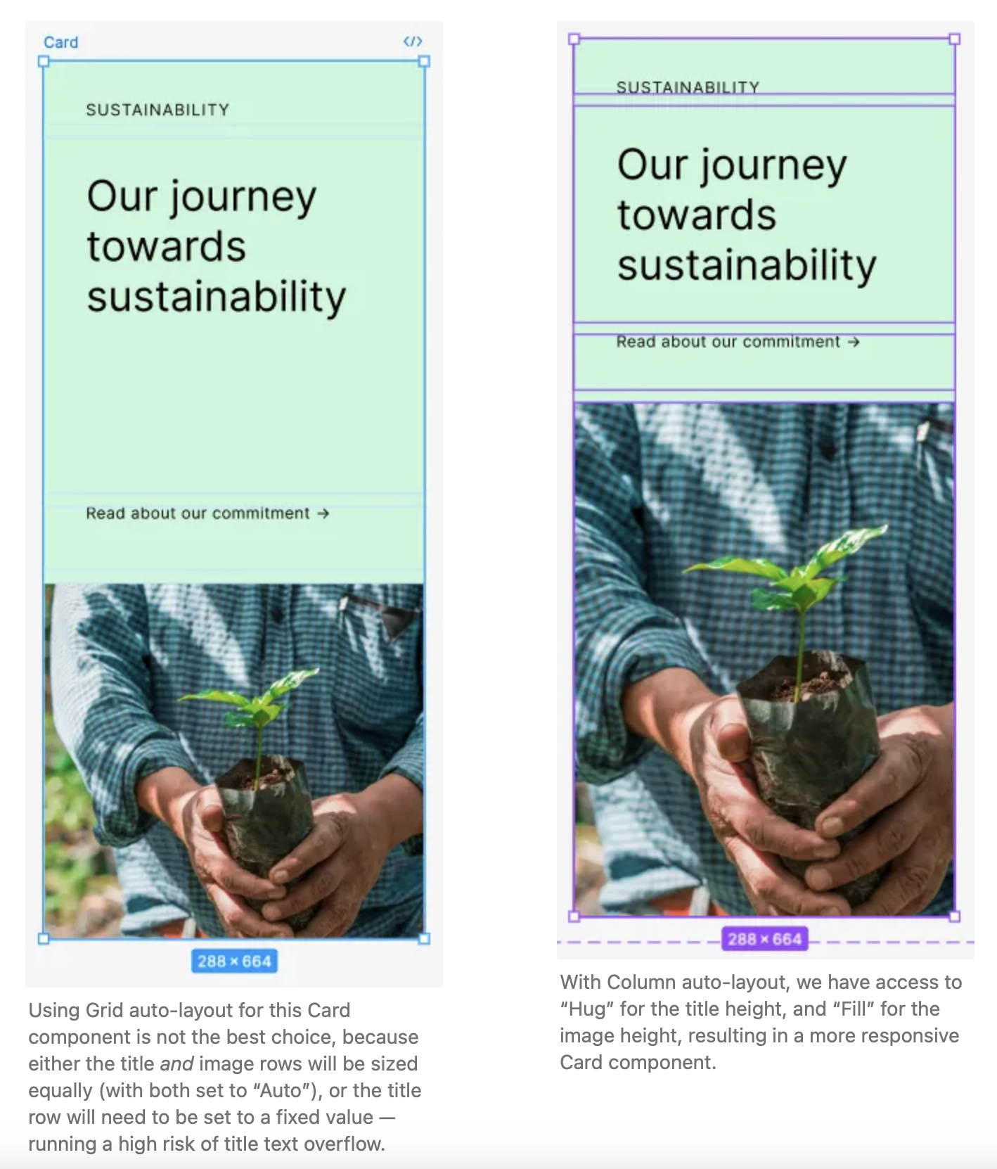
Take, for example, the below card design (shown at a mobile breakpoint), containing eyebrow text, a variable-length title, a call-to-action link and an image. Perhaps we can use Grid auto-layout!
On the left, with Grid auto-layout applied, we’ve set the eyebrow text and call-to-action link to 48px, and the title and image rows to “Auto” — which, instead of individually sizing those rows to their contents’ intrinsic size as CSS Grid would, has set both rows to equal heights by dividing the container Frame’s remaining space in half.
The above right-hand example can be made using CSS Grid, but cannot be made using Grid auto-layout. For now, avoid the temptation to try it, or at least until thefr unit is added to Figma.
One implementation strategy to ease stylesheet legibility and maintainability is to use CSS Grid when a component has different layouts depending on its size. The above example is a “wide” (desktop) variant of the previously-shown “narrow” (mobile) Card component, and is laid out in Figma with Grid auto-layout.
💡In considering how a design might be implemented during its creation (in the above example, the consideration of whether or not a single layout module could be used to optimise the component’s styles), a designer invariably helps a developer more clearly implement the design and positively contributes to a better end product.
Drag and drop, and repositioning Grid content
Adjusting the position of elements in a Grid auto-layout is a frustrating process. Elements will only reposition to the right of, or below, the drop target cell. And adjusting the order of Grid child elements using the left-hand-side hierarchy/tree view, unlike Row or Column auto-layout, only affects the “z-index” or layering aspect of Grid auto-layout children, not their display order in the Grid.
I’d wager that the above repositioning behaviour when dropping an element, generally speaking, would not be expected by most users.
If, after creating a Grid auto-layout, you need to reorder or resize any of its members, it’s advisable to first create a copy of the Grid, remove all members from the Grid, and then manually add each back in at its new position or with its new size.
So what can I do with Grid auto-layout?
Figma describes the layout mode as suitable for “galleries, bento boxes and more” — which seems to be an accurate list. Grid auto-layout seems to be helpful in scaffolding out the main content areas of a screen, or in laying out a flat set of equally-sized elements.
However, you are likely to encounter unexpected issues beyond the above use cases, particularly if you expect the auto-layout mode to behave exactly in accordance with the CSS Grid module.
Here’s a “masonry”-style (or bento box) layout of cards, built with Grid auto-layout. Grid makes it very easy to swap the placement of elements by drag and drop. As also stated in many other places in this article, use caution with the size of Grid elements, especially when they include longer copy.
Tables
Tables are worth mentioning as a special case, given that they are likely to come to mind as a perfect use case for Grid auto-layout.
A simple table, created with Grid auto-layout. All the above cells (including those in the “heading”) are sibling elements, making it much simpler to rearrange table contents than when “cell” elements are nested inside row and/or column frames.
Building a table with Grid auto-layout is very simple, with a few caveats. To most easily control alignment of table cell contents, set the outermost frame of the cell (component) element to either Row or Column auto-layout. That way, using the auto-layout alignment selector, you can select all cells and set (or update) their alignment in just a few clicks. You can also set the Grid’s heading row, if desired, to a fixed height to better distinguish it from table body rows.
Some caveats in building a table with Grid:
A fixed dimension is required along one axis
Grid auto-layout rows and columns will not resize to their members’ intrinsic size. This can be especially troublesome when using text. Rather than a table row’s height growing to fit its contents, it remains the same height (whether set to “Auto” or a fixed-pixel value). To retain full legibility of any text content, a Grid auto-layout table will require a fixed height and/or minimum width. (You could also opt to truncate text overflow with the ellipsis option in the text options pane.) Carefully choose the setting where your auto-layout table is placed, in other words.
The same table example as above, at a narrower width. If the above example is used in a context where you can guarantee the table’s width and height to not shrink beyond a certain point, then using Grid auto-layout would be a safe (and very simple) choice.
Aligning multiple tables
Attempting to align multiple tables with an outer Grid can prove tricky, as with the top example.
Sometimes, using Grid to scaffold or block out layouts might not work quite as intended. Here, the layout breaks from the design’s intent (better illustrated and explained by the below example). Both rows are necessarily set to “Auto”(as each table’s height is indeterminate and a fixed value would break if the content changes), which results in the rows unfortunately sharing equal heights.
A cleaner solution (the second image) might be to instead use a combination of Row and Column auto-layout. Compared to the previous example, this layout better executes the design’s intent: to align order number and section headings at the top; for the “Account” section contents to vertically span the layout; and for the columns of both right-hand tables to appear aligned. To “fake” an appearance of shared column widths among the stacked tables, simply set equivalent column and gap values for all tables.
A purchase order detail layout example, in which the designer has attempted to lay out screen content with Grid auto-layout.
Another purchase order detail layout example, this one constructed with Row and Column auto-layout.
Dev mode
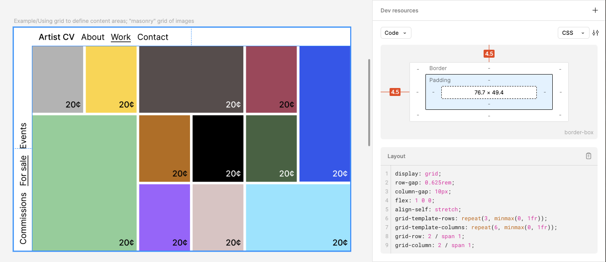
A lovely feature of Grid auto-layout is that it exposes the CSS Grid values of a given Grid auto-layout to developers via Dev mode!
A screenshot showing the appearance of Dev mode when inspecting a Grid auto-layout frame.
Figma outputs functional CSS row and column assignments for all Grid children, and CSS row and column templates for the Grid’s parent frame. Though the output is limited to Grid column and row track values of either fixed pixels/rems (depending on the developer’s choice of unit in Dev mode) or minmax(0, 1fr), the CSS output nevertheless is an excellent starting point for exactly delineating a Grid’s intended values.
If familiar with the values you can use with grid-template-[rows/columns], then you might notice that Figma has opted to set “Auto” columns and rows equal to minmax(0, 1fr). This roughly translates into “keep these exactly equally-sized, without respect to a minimum size.”
If this behaviour is not how a particular design should operate, perhaps take advantage of Figma’s Annotate tool, and let the developer know what the design needs.
💡Both pixels, rems and 1fr, are absolutely adequate values to use with Grid! In certain cases, a Grid might require auto-flow, percentages and/or repeat(auto-fit/auto-fill, …) — which would likely be arrived at by way of conversation between designer and developer, or otherwise communicated via prototype, annotation, etc.
What doesn't Grid do (yet?)
CSS Grid capabilities not yet offered by Grid auto-layout can, in some cases, be mimicked (as with percentages and fractional units), and in others, the concepts (such as named areas and tracks) can be applied via annotation.
Percentages and fractional units
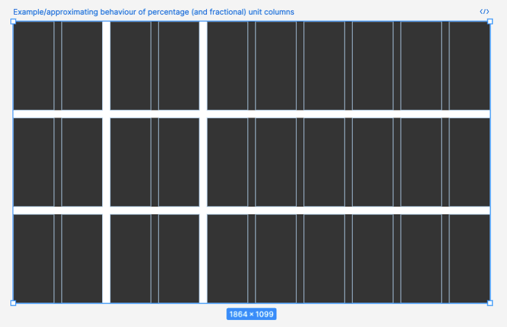
While not (yet) offered as valid Grid row or column values, percentages and fractional units (e.g. 1fr) can be approximated by spanning multiple columns or rows, as shown below:
The faint blue column lines above indicate the positions of this Grid’s ten columns and gaps. This example approximates grid-template-columns: 1fr 1fr 3frorgrid-template-columns: 20% 20% 60%.
<custom-ident>
CSS Grid allows for custom identifiers (names) when defining row and column track names (by way of grid-template-columns or -rows), as well as when defining named template “areas” where content can be placed (using grid-template-areas defined on the parent in combination with grid-area defined on the child).
These more legible (and thus less prone-to-error) identifiers aren’t yet a part of Figma’s Grid release, and would aid in retaining the design’s semantics (or better, intent) in the eventual implementation. In the meantime, consider using annotation in Dev mode or some other means by which to clearly communicate to a developer the semantics of your design.
Setting and using grid template areas with custom identifier names, aside from being very efficient, makes for highly-legible code. It would be lovely if Figma expanded Grid auto-layout to expose this aspect of CSS Grid. In the meantime, well-labelled layers and elements will go a long way in guiding a developer toward a proper implementation.
Subgrid
Figma’s Grid allows for nesting grids. However, track sizes cannot (as far as I can tell, anyway) be inherited as with grid-template-[columns/rows]: subgrid. In some situations, designers will still have to nudge and/or “fake” a layout for any nested Grid’s cells to appear related/behave responsively. (Take a look at the “Table” section above for a visual example, and read more about CSS subgrid at MDN.)
Conclusion
Figma’s beta release of Grid auto-layout promises to improve workflows for designers and developers alike. The new layout mode does do its job well (laying out items in a grid) while leaving some room for improvement.
I see an even brighter future on the horizon for Grid auto-layout, with subsequent versions expanding the capabilities I’ve addressed in this article. This will improve the communication from designers to developers even further and lead to even better end-user experiences — the end goal for everyone.
Sources and resources
Figma’s Grid Playground file, which goes through the basics of Grid auto-layout mode and calls out some important “gotchas.”



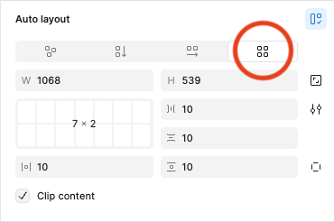 The toggle for Figma's new Grid auto-layout mode
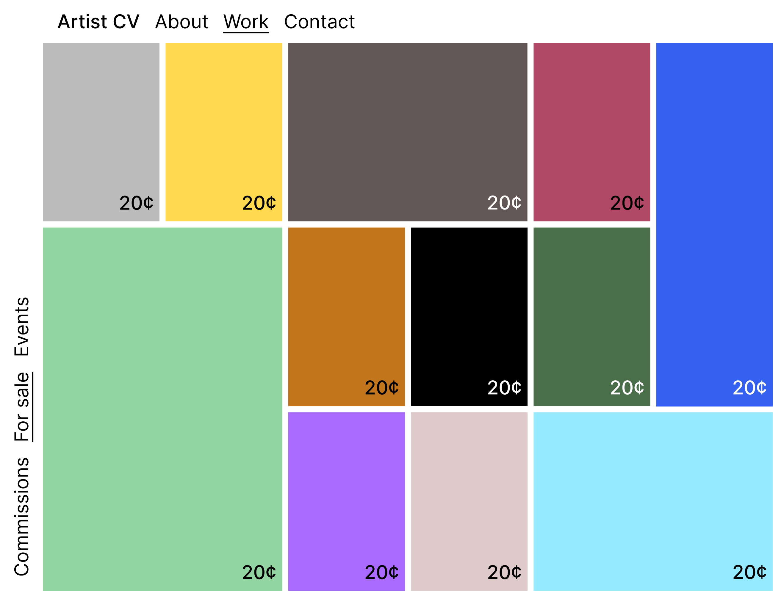 A simple example of what Grid auto-layout might best be used for: blocking out a screen’s main content areas (in this case, top navigation, left-hand navigation and the main content), and laying out similar items into a grid or “masonry”-type arrangement. (Source: Barret Anspach)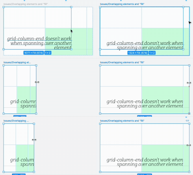

 One implementation strategy to ease stylesheet legibility and maintainability is to use CSS Grid when a component has different layouts depending on its size. The above example is a “wide” (desktop) variant of the previously-shown “narrow” (mobile) Card component, and is laid out in Figma with Grid auto-layout.
 Here’s a “masonry”-style (or bento box) layout of cards, built with Grid auto-layout. Grid makes it very easy to swap the placement of elements by drag and drop. As also stated in many other places in this article, use caution with the size of Grid elements, especially when they include longer copy.
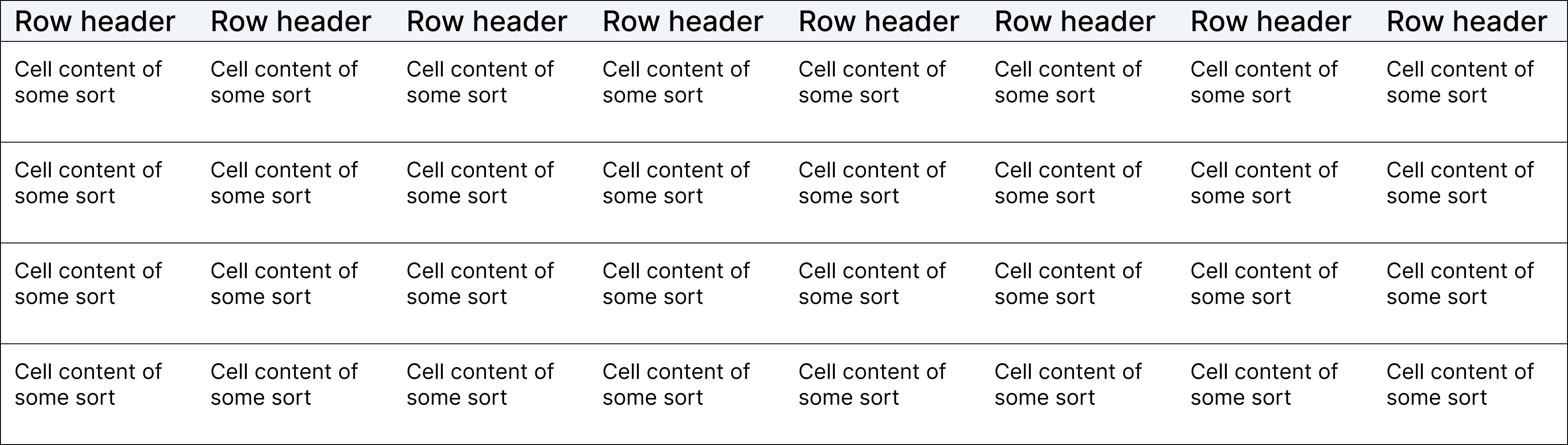 A simple table, created with Grid auto-layout. All the above cells (including those in the “heading”) are sibling elements, making it much simpler to rearrange table contents than when “cell” elements are nested inside row and/or column frames.
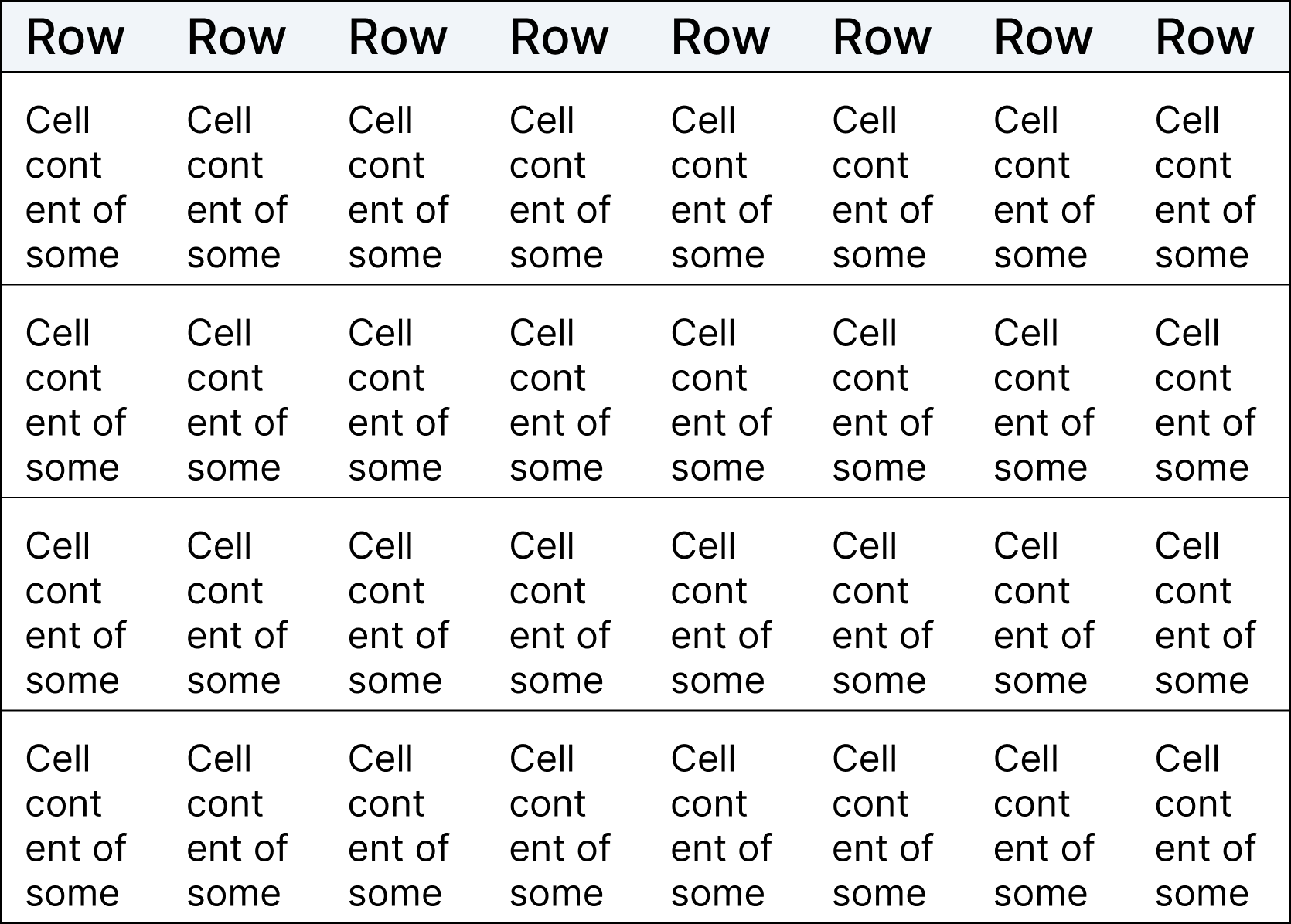 The same table example as above, at a narrower width. If the above example is used in a context where you can guarantee the table’s width and height to not shrink beyond a certain point, then using Grid auto-layout would be a safe (and very simple) choice.
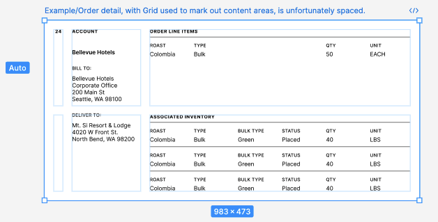 A purchase order detail layout example, in which the designer has attempted to lay out screen content with Grid auto-layout.
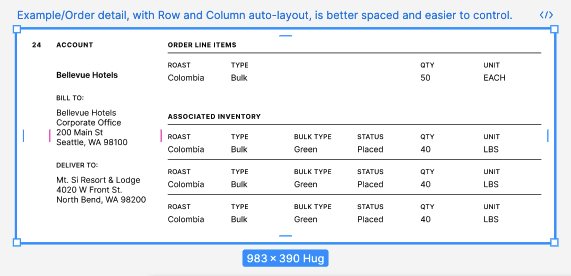 Another purchase order detail layout example, this one constructed with Row and Column auto-layout.
 A screenshot showing the appearance of Dev mode when inspecting a Grid auto-layout frame.
 The faint blue column lines above indicate the positions of this Grid’s ten columns and gaps. This example approximates
